
Swing and a Miss: How Nike Has Continuously Struckout on Their MLB Uniform Designs
By Jack Zinke | 31 Mar 2025

Baseball, dubbed ‘America’s Pastime,’ has long been viewed as a timeless sport. Much of its allure is built on nostalgia and tradition. To this day, organ music still rings through the outdoor stadium seats as the smell of hot dogs, Cracker Jacks, and popcorn combined with freshly-cut grass and powdery red dirt make up the aroma in the air. Baseball legends such as Babe Ruth, Ted Williams, Hank Aaron, and Willie Mays are still relevant figures in the game, though their playing eras have long passed. Baseball feeds off of the past, and this is evident in their seemingly unchanging uniforms. The New York Yankees’ current ‘NY’ logo is nearly identical to how it appeared over 100 years ago and the pinstripes still remain a defining part of their iconic uniforms. Other storied MLB franchises have also kept their traditional, beloved uniforms in an attempt to keep the nostalgia alive. So many team uniforms are almost exactly the same as they were at their teams’ origins. Well, at least they used to be the same.
In December 2019, textile company Majestic Athletic was replaced by Nike as the official, on-field uniform provider for Major League Baseball. Majestic had run the show for MLB since 2005, providing high quality jerseys, pants, caps, and other products that stuck true to the basic simplicity of the nostalgic baseball uniforms of the past. Although highly pushed for by those seeking additional profits, sponsored brand patches never made their way to the Majestic jerseys as the company sought to keep the uniforms visually appealing. Pants hardly ever ripped or tore and the jerseys did not easily reveal sweat stains; however, as Nike entered the MLB market in the shortened 2020 season, the league’s notable uniform aesthetic would be changed forever.
While switching to such a large and recognizable brand like Nike seems to be a great move for MLB monetarily, inevident costs were not exactly accounted for at the time of the transition. At the top of the list for changes that Nike brought to the MLB uniforms is the significant decrease in quality. This comes in many forms. Using cheaper materials for both jerseys and pants, Nike sought to cut production costs while maintaining relatively similar revenue. Both fans and players took immediate notice of the changes in quality as early as spring training in 2020. Players that were profusely sweating in hotter environments noticed that the sweat would become easily visible through the new thin material that Nike had begun using. Nearly every time he touches the mound, New York Yankees pitcher Carlos Rodon appears to have jumped in a pool while wearing his jersey as he quite obviously sweats profusely while pitching. Rodon is not the only player to have had this problem with the thin jersey material as complaints rained down across the league.

New York Yankees pitcher Carlos Rodon in his sweat-soaked Nike MLB jersey.
In uniform combinations that featured white pants, the thin material also clearly revealed the bottoms of the jerseys that were tucked into the trousers. This made for a very tacky and cheap uniform look for Major League Baseball, a league traditionally associated with quality and professionalism. Again, this was an issue that both fans and players alike were very upset to see in their traditionally high-quality baseball uniforms.

Los Angeles Dodgers’ Japanese superstars Shohei Ohtani and Yoshinobu Yamamoto posing in their nearly ‘see-through’ Nike MLB pants.
The nearly ‘see-through’ pants also had extremely negative repercussions for young San Francisco Giants infielder Casey Schmitt. While I cannot share the photo because of its revealing ‘nature,’ let’s just say that Schmitt’s identity may have been unearthed by the white see-through pants that he sported on media day. Fans took to social media, humiliating Schmitt for unknowingly revealing his manhood to the world in an utterly embarrassing photo shared by Giants media sources. Thankfully, Schmitt laughed it off and did not seem to take it too seriously; however, this mishap by Nike could easily have produced a much worse outcome in which a person’s privacy may have been seriously violated because of the company’s choice to provide cheap, thin pant material.
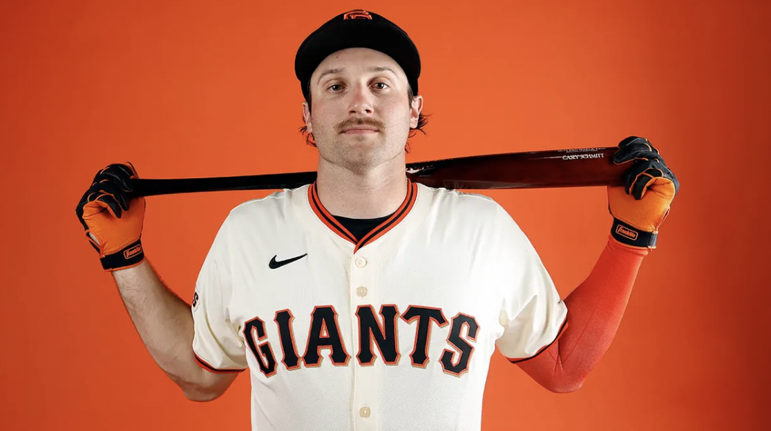
San Francisco Giants infielder Casey Schmitt, who unfortunately had a wardrobe malfunction in Nike’s ‘see-through’ white uniform.
The thin material had also produced many instances in which pants were easily torn or ripped when sliding into a base or diving for a ball. While rips would occasionally happen prior to Nike’s takeover, the problem dramatically increased post-transition. Thin clothing was not the only problem that the new uniform designs had produced.
Arguably the most notable change to the MLB uniforms under Nike, was the change in lettering and numbers on the jerseys. Majestic’s jerseys had boasted large letters and numbers that resembled jerseys of the past. These jerseys were very aesthetically pleasing and were easily readable for a fan attempting to spot their favorite player on the field. Yet when Nike took over in 2020, the sizes of the letters and numbers on the backs of the jerseys were dramatically decreased and some fonts were even obviously altered. The quality of the ironed-on letters and numbers was obviously diminished. This brought a great wave of outrage from fans that did not find it justifiable to charge large sums of money for a jersey that was now quite obviously so cheaply assembled. So not only did the new cheap uniforms anger players for their functionality, but they also angered fans over the high cost of a clearly diminished product.

A Before (Left) and After (Right) photo of the Seattle Mariners’ white home jerseys that featured smaller lettering, altered fonts, changes in color, and a strange placement of the MLB patch.
Another major alteration to MLB’s traditional uniforms was the addition of brand sponsorship patches to the uniforms. While this makes sense monetarily for MLB, it damages the beauty and cleanliness that an untouched baseball uniform once possessed. With the NBA moving to sponsored jerseys, MLB was almost certainly going to move in this direction, damaging their jerseys’ former appeal. While it may be disappointing to see unrelated brands on the sleeves of baseball jerseys and caps, a large issue that I take is the size of the logos that have been plastered across the uniforms. The emblems are humongous and take up almost the entire sleeves of some teams’ jerseys. The logos often draw your attention away from the clean-looking front of the uniform to a busy, distracting mess that is all over the sleeve. So Nike seemingly thought it was justifiable to substantially decrease the size of the nameplate and number on the back of the jersey, while simultaneously adding HUGE brand logos to the sleeves of the jerseys. This seems just a little bit contradictory to me. To make matters worse, many of the brands that are featured are completely unrelated to baseball or even the city that the team is based in. This furthers the idea that the brand sponsored logos are greatly diminishing the aesthetic appeal that baseball jerseys once boasted.

A few of MLB’s brand sponsored patches for the San Francisco Giants, Detroit Tigers, and New York Mets.
While the changes to the classic uniforms have been atrocious themselves, Nike has taken the liberty of creating their own MLB jersey line. They have added the City Connect alternate jersey that each MLB team can add to their wardrobe arsenal. The idea is that the design of the jersey has some relevance to the home city of each franchise. For example, the Boston Red Sox’s City Connect uniforms pay homage to the Boston Marathon. While Boston’s tribute is nice, the design is unfortunately quite horrible. A bright yellow jersey, with stenciled blue lettering does not really resemble the Boston Red Sox and makes for one of the ugliest MLB jerseys that have ever graced the field.

The Red Sox’s City Connect uniforms that serve as a tribute to the Boston Marathon.
Other teams across the country have produced better products than Boston that actually serve as very unique and likeable uniforms. Despite this, the vast majority of the City Connect uniforms are hideous and completely take away from MLB’s historically beautiful and simple designs.

The Pittsburgh Pirates donning their oddly designed ‘PGH’ City Connect uniforms.

Superstar Bryce Harper draped in a faded ‘Philly’ City Connect uniform that features the Liberty Bell on the helmet.
Since taking over, the incredibly vast changes that Nike has made to the Major League Baseball uniforms has sparked so much discontent among fans, players, coaches, and anyone remotely involved with the league. In response, Nike has vowed to return much of the uniforms’ features to their prior states. In the early stages of this 2025 season, we have seen improved quality of the pants and jerseys as well as a return of larger letters and numbers on the backs of jerseys. Not everything is being reverted however. The brand patches remain in place for certain teams and new City Connect designs continue to roll out. It remains to be seen whether Nike will continue to pull back some of their alterations in an attempt to regain the popularity that baseball jerseys once garnered from fans. Baseball is a sport that has steadily declined in popularity since the 1990s and this trend may be influenced by Nike’s decision-making regarding uniform design. Unless efforts are made to right their wrongs, Nike will continue to feel the hurt of their mostly poor design choices since taking over Major League Baseball uniform production.